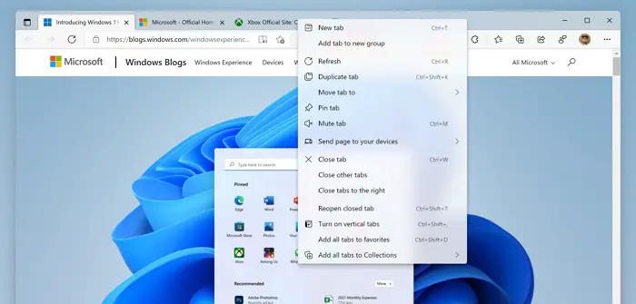
In a tweet, the Windows Insider’s official account revealed a new flag for Edge. This flag allows those running Microsoft Edge Canary on Windows 11, can now preview the new visual design that compliments Windows 11 design language. Microsoft revealed Windows 11, two weeks ago, and post that there has been one update, and many new things and changes being revealed, and this is one of them.

Preview Edge’s new Visual Design on Windows 11
The flag— Enable Windows 11 Visual Updates —brings in the transparency or rather translucency mode that is available across the new OS. So when you right-click anywhere on the browser, the menu will pick up whatever is in the rear.
To enable it to follow the steps as below:
- Make sure you have Edge Canary. Launch it.
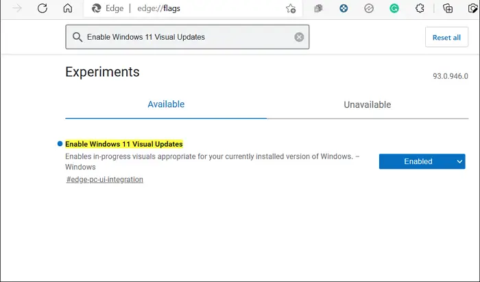
- Open a new tab, and type edge://flags and press the Enter key
- In the search box, type Enable Windows 11 Visual Updates
- When it appears, use the dropdown next to it to enabled, and restart the browser.

The flag says—Enables in-progress visuals appropriate for your currently installed version of Windows, Interesting to note that this flag is specific to Edge Canary and not just Windows 11. If you have Edge on Windows 10, you can enable the same and see if it makes a difference.
That said, the flag doesn’t seem to be working for all. It did not work for me on one of the PCs. Also, there are bugs such as corners are not rounded, the dark theme has its issues, there’s a line between inactive tabs in dark mode but not in the light, and so on.
Many of you like to call it the Mica or the glass-like effect or the Windows Aero effect! The confusion between Mica and Acrylic is also a talk in the Twitter thread. According to Microsoft documents, context menus use the acrylic effect, while larger surfaces use the mica effect. They are different kinds of blur effects.
Leave a Reply