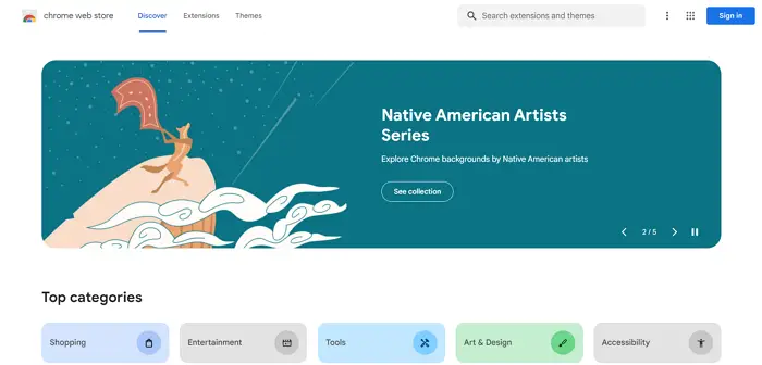
Google has redesigned the Chrome Web Store inspired by the Material You language, which gives the store a new look, color palette, tabs, and navigation. The entire UI is redesigned so that it fits other Google products using the Material You design-inspired looks.

Google redesigns the Chrome Web Store
Inspired by our Material You design language, the new store has fresh color palettes, updated card styles and improved icon legibility that all better complement Chrome’s overall look.
Google has used the Material You inspired designs on Android and its Pixel phones and other devices. The new entrant to that list is the Chrome Web Store. Material You design is known for its personalized style, adaptability on every screen, and accessibility. Chrome Web Store has been redesigned with the Material You design and released in a limited preview earlier. Now, Google has rolled out the look to everyone where you can access Chrome extensions and themes in the new Chrome Web Store. The Material You design gives the new Chrome Web Store some fresh color palettes, updated card styles, and improved icon legibility and enhances the overall look of the Web Store.
Google mentioned in its blog that, with the new Chrome Web Store, Google has added new extension categories like AI-powered and shopping extensions and recommendations based on your previous installations. Newly launched extensions that are worth trying get listed in the new Editor’s Spotlight.
The new Chrome Web Store is mainly focused on easy navigation. The search bar is now accessible quickly from the top right of the screen with improved search capabilities like filtering by all items or featured extensions and themes to find the exact thing you want.
Leave a Reply