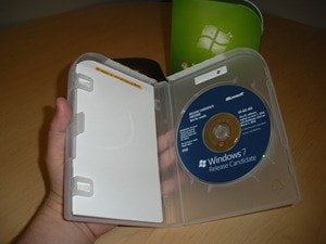
Microsoft approached the packaging for Windows 7 the same way we approached the product – by listening to what our customers told us they wanted: make it a simple clean design, easy to open, and reduce waste.

Customers told us they liked the big bold Windows logo and how it clearly communicates that it’s Windows 7. They like larger typefaces to make it easy to read, and they like background colors for each edition to make it easier to differentiate between Windows 7 Home Premium all the way to Windows 7 Ultimate. In their own words, the “clean” design gives off a “fresh” feel.
The plastic case protecting the Windows 7 disk is lighter and is recyclable. The packaging itself has a 37% weight reduction and a 50% improvement on it’s econometrics score over the predecessor.