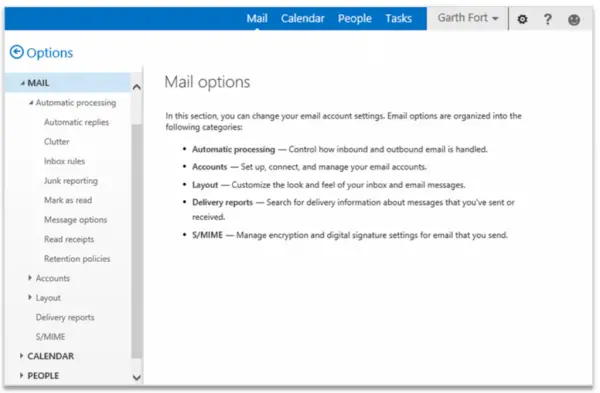
The Exchange Engineering team in Microsoft is often busy in adding new features to their services and lately they came up with some significant improvements in Outlook Web Apps and its settings. These improvements will provide a better and more intuitive navigation and a cleaner user interface.
Improvements in Outlook Web App settings
The all-new drop-down with multiple options provides an easy navigation. Users can configure your Outlook settings according to your preferences. Clicking on any option will take you to the new user interface where all the options and settings are categorized with proper sections and sub-sections in a single and streamlined navigation tree. Clicking on any options or section will take you to its corresponding Settings option in the right pane. with multiple options provides an easy navigation.
Users can now configure your Outlook settings according to your preferences. Clicking on any option will take you to the new user interface where all the options and settings are categorized with proper sections and sub-sections in a single and streamlined navigation tree. Clicking on any options or section will take you to its corresponding Settings option in the right pane.
As posted by Will Holmes, a senior program manager on the Exchange engineering team, these improvements will start rolling out over next few months. Holmes also stated in his blog post that not all the options are added in the left pane navigation tree and those options will still be accessible through the dropdown menu.
These improvements and added features will support the tablets and Smartphones running the Outlook Web App in the near future.