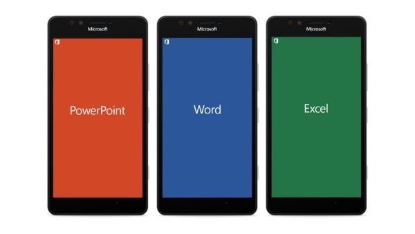
Office on mobile has come a long way since the days of Windows Mobile, Windows Phone, and now Windows 10 Mobile. In the early days, Microsoft always moved in the direction where the majority of its software was only available on Windows, but that is no longer the case.
Ex-Microsoft designer, Jon Bell, talked about what was going on behind the scenes when Microsoft was developing Office Mobile. This is the man who led the design of Office Mobile before he left the company. According to Bell, he was “tasked with leading the design on PowerPoint, Word, and Excel on Windows Phone.”

Creation of Office Mobile
Bell stated that one of the first major task when designing Office Mobile, was whether to come up with a design that centers around Office or the Windows Phone UI, we know it as Metro. At the end of the day, the company went ahead with a single design for all platforms to make it easier for folks who use different mobile operating systems.
Anyone that have used Office on Android, iOS, and Windows Phone, should realize that while the apps have a similar UI design, the navigation keys are different. This was intentionally done to allow users to feel right at home. The app should not feel like a Windows app on either Android or iOS.
Another important aspect, was the fact that the design had to scale. The team worked on a responsive design that could fit well on any screen size and still looks great. It still requires fine tuning here and there, but the basic layout was already planted.
Read the full breakdown at Design Explosions.
Leave a Reply