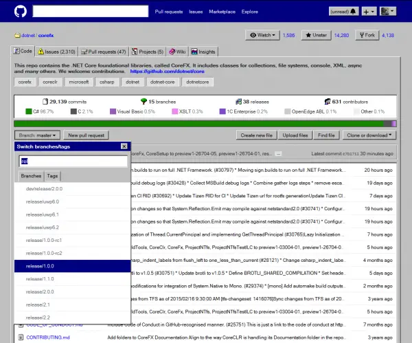
Microsoft recently acquired GitHub at $7.5 billion. The deal was concluded at a price that was more than three times the initial estimates. As expected many of the folks started switching to other services once Microsoft announced the GitHub acquisition. Microsoft has been talking about fostering the open source environment, however, the company is not exactly known for its pro-open source stance. GitHub has now introduced a new theme that lets you taste the Windows XP interface on GitHub.

GitHub Windows Edition
The user style is called “GitHub Windows Edition” and as it can be seen the UI seems to borrow heavily from Windows 95 and 98. The dark grey title bars and the old style icons are designed to stir up those old memories. The new user style will work with both Chrome and Firefox and can be used alongside Stylish extensions. That being said not all parts of the website have been fully transformed and the style is mostly a proof-of-concept.
Users can download and install the GitHub Windows Edition by heading over to this link. However, the new user style suffers from a few issues. For instance, the requirement of elements to have multiple borders, size of some controls like buttons have been changed. If GitHub uses pixel sizes for buttons, the icon maybe cut by a few pixels. In some cases, the focus borders may also be displayed incorrectly.
Features:
- Some icons changed into icons from Windows 9x.
- Almost pixel-perfect reproduction of buttons, tabs, separators, groups, edit boxes, list boxes, tooltips, windows.
- Some UI has been transformed, for example, repository stats are displayed as a shell list box, and various group boxes have been titled.
- Focus rectangles, text selection styles and other elements adjusted where possible.
The instructions to download and install GitHub Windows Edition are given here.
Leave a Reply