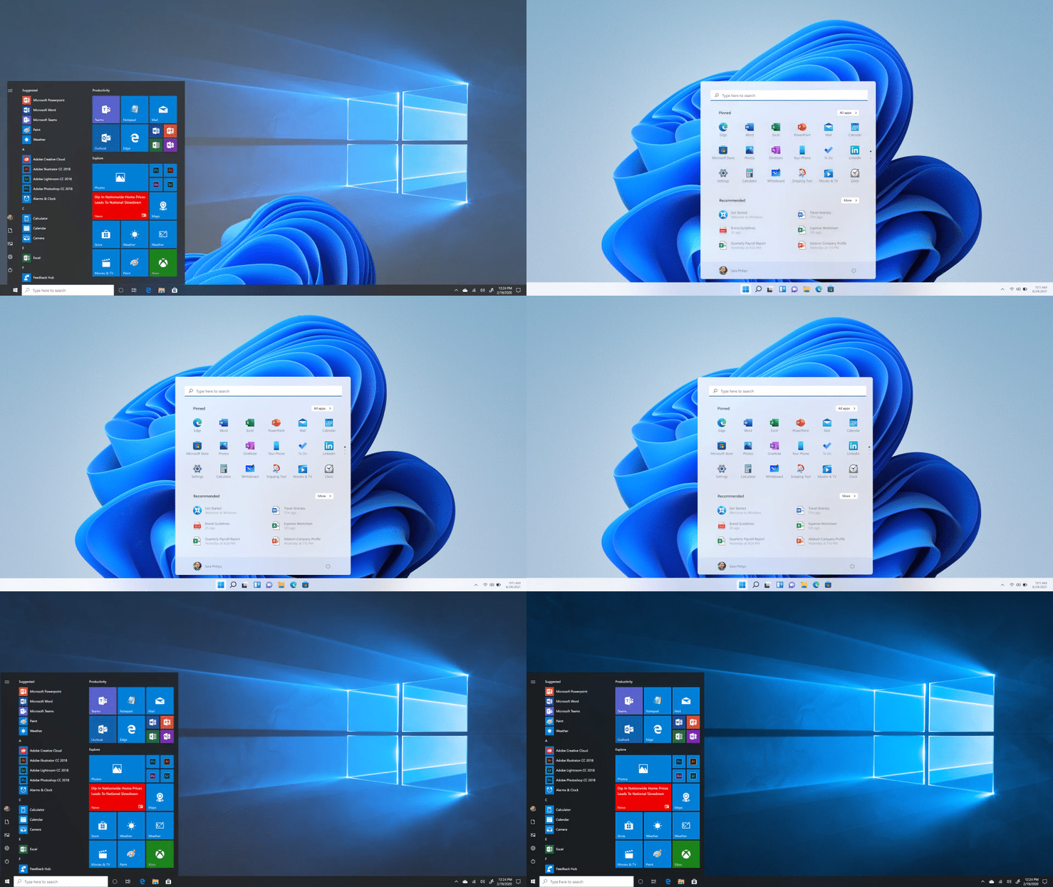
Windows 11 is undoubtedly one of the significant design overhauls the OS had seen since its inception almost three decades ago. The transition from the less-modern Windows 7 and the half-baked 8.1 to Windows 10 was a huge step for Microsoft. However, after more than half a decade, Windows 11 has used a design that takes inspiration from multiple sources. This process could not have been simple, and the core designers at Microsoft have published their experience of designing Windows 11 OS through a Medium post by Microsoft Design page.

Windows 11 design secrets revealed
It is worth noting that Windows 11 entered the stage of rapid development only recently. It means the devs and designers had time to consider what today’s consumer computing demands. For instance, the designers say they had time to analyze how the world had changed in the past two years, especially following the pandemic and the workspace-based changes.
The designers have also talked to customers who shared what they expect from an Operating System to meet their goals. In short, the company had moved the focus from business to people, understanding what individual users of Windows expect from Windows 11.

According to the team, what we see as the UI and UX of Microsoft Windows 11 results from thousands of testing rounds based on many research studies. One may think that the transition from Windows 10 to Windows 11 replaces the Metro Design Language with Microsoft Fluent. However, the core designers behind Windows 11 have a different opinion.
For instance, they add that Windows 11 has been well optimized for bringing Calmness to the consumer. Many options bring the user closer to their friends, family, acquaintances, etc. In addition, the team has added options for entertainment and creativity.

The ongoing pandemic is also a reason why Windows 11 takes a different approach towards features. The design team at Microsoft believes that people have appreciated the flexible nature of their PCs while getting ready for the hybrid work system in the past years.
The design language thus wanted to put the user in the center, with the help of many components, including the Start Menu. As we have seen on many screenshots, the Start menu on Windows 11 has been moved to the center spot. Thus, it becomes a personalized space where users access their essential apps, files, and other content when getting started.
It is also clear that the team has optimized every single pixel for efficiency. Once a user starts working, the brand-new navigation design will make things easy. As we have noted, Windows 11 has been designed for a lot of one-click interactions.
Because people need different digital workstations within a single device, the Windows 11 design has been optimized. Then, of course, all these transitions become more perceptible, all thanks to the bright icons. In the end, the Microsoft team says that Windows 11 is more than an OS.
It marks the shift of focus from mere functionality towards a profoundly personal PC experience.