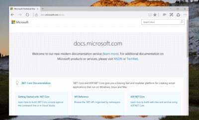
The latest update to Microsoft Docs Online has brought into play a slew of new features that will eventually help enhance users enhance their experience with the tool. The improvements have been across several parameters and hopefully armed with the improvised features Microsoft Word Online will be able to rival the likes of Google Docs.

Performance improvements have been the cornerstone of this update and the team at Microsoft have improved the underlying code and the CSS, both of which reduced the size of the fetching page by 40% and eventually makes it easier to access documents on slower connections. Site wide search bakes the search feature right into the word.
Reference Content Styling is yet another mention worthy feature, this lets users navigate across various pages within the site and familiarizes them with the layout and all the other options. To make this happen Microsoft has made improvements to the API reference documentation pages.
Moreover, theme switching has been made easy, if you are a regular user you might have observed that the light theme is switched on briefly while moving from one page to another, with the update you will no longer experience the delay in theme switching.
Docs.microsoft.com is known for its ability to support a varied range of locales for international content. Users had to make use of language picker and this was hidden inside. The access to the color picker feature has been replaced by a better drop down one that would be accessible with a keyboard. The navigation bar on the right is now sticky in nature, this means that irrespective of scrolling down the documents you will still be seeing the navigation bar at the right.
Read the full details at source.
Leave a Reply