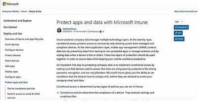
Based on the feedback gathered from the interviews of hundreds of developers and IT Pros, Microsoft has introduced a documentation site called as docs.microsoft.com. To start with, Microsoft is first revamping the existing content infrastructure on TechNet and MSDN.

TechNet contains all resources and tools designed to help IT professionals succeed with Microsoft products and technologies, whereas MSDN helps developers build apps. They will be overhauled with a new site docs.microsoft.com, possessing a new consistent look and features.
docs.microsoft.com key features
Readability, as Microsoft says is one of the major improvement that docs.microsoft.com will bring to the readers. The company further mentions on the blog,
“To improve content readability, we changed the site to have a set content width. Eye tracking studies have shown that you can improve comprehension and reading speed with a set content width as it’s difficult for the eye to follow long passages left-to-right. We’ve also increased the font size for the left navigation and the text itself, something customers have been asking for (UserVoice – Increase Font size)”.
Estimated Reading Time
Articles at the docs.microsoft.com would mention an estimated reading time for reading them, giving an idea of the time commitment for the readers. There are also date stamps added to the content to help readers understand how fresh the information is based on UserVoice feedback.
Content and Site Navigation
Microsoft has distributed the content on docs.microsoft.com into logical groupings like evaluating, getting started, planning, deploying, managing, or troubleshooting products or services.
To ensure that lengthy articles don’t make the navigation to the needed information difficult, content at docs.microsoft.com would be arranged into smaller logical steps and Microsoft is providing “Previous and Next buttons” at the bottom of articles to navigate between steps in a multi-part tutorial.
Responsive design is another improvement that Microsoft is bringing in to provide a great user experience on mobile devices, tablets, and PCs. All documentation on docs.microsoft.com would be open sourced and designed to allow community contributions.
Other features on docs.microsoft.com include Livefyre integration on articles to provide comments and Sidenotes, social button at the top of the page for easier sharing, readable URL’s and ability to choose between light and dark theme.
The current preview release of the new documentation service is currently just for Enterprise Mobility Documentation (which consists of Advanced Threat Analytics, Azure Active Directory, Azure Remote App, Multi-factor Authentication, Azure Rights Management, Intune, and Microsoft Identity Manager).
Microsoft says that the company would be migrating more of its existing documentation onto this new experience.
Leave a Reply