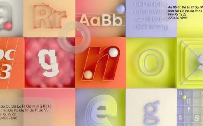
Calibri has been an essential font on Microsoft products for an extended period. Microsoft has also used the font as the default one for its applications, including the Office suite, since 2007. After fourteen years of service, Microsoft plans to replace Calibri with five new fonts.

Microsoft’s next default font
According to Microsoft, the company has commissioned five new fonts. However, it will take some time to decide the default font from the list. Microsoft has also opened up an option to let the company know which font has your support via social media.
Microsoft also shared information about the five new fonts:
- Tenorite,
- Bierstadt,
- Skeena,
- Seaford,
- Grandview.
Each of these fonts represents a unique sans-serif style. While one of them is humanist design, others have chosen industrial and swiss-style designs. The typeface design also emphasizes how spaces are arranged between different letters.
Designers say they have designed the Tenorite font as an evolutionary successor to Calibri. Compared to Calibri, which had soft corners, Tenorite is noted for its round shapes and geometric designs.
Designers also say the Swiss-type font has been inspired by what Microsoft already has in store and what it can use as an extra font. The other font, Skeena, designed by John Hudson and Paul Hanslow, also comes with a story of insightful design.
The designers claim they have designed the font with utmost precision to each character and its curves. Seaford by Tobias Frere-Jones, Nina Stossinger, and Fred Shallcross comes with a comfortable and animated design with an outlook that spans across the system.
Last but not least, the Grandview font by Aaron Bell is inspired by German road and railway signage.
Read: How to change default font in Word, Excel, PowerPoint.
You can now read more about these fonts and download them. As mentioned earlier, users do have an option to let Microsoft know which one they like the most.
Leave a Reply