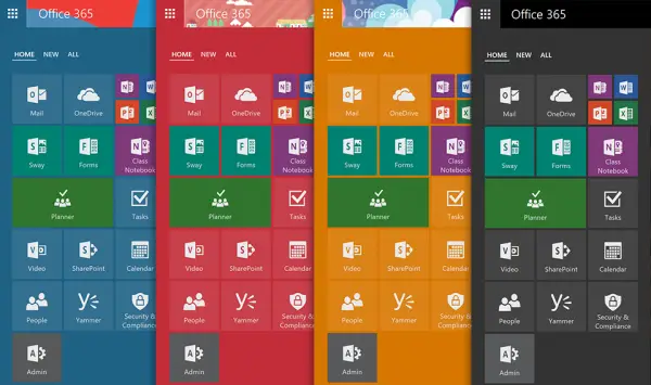
Office 365 offerings are being bettered with every update and not in order to increase the productivity further Microsoft has announced a new Office 365 App launcher which comes with improved discoverability for new and recently used apps, more customization options and better search across all the services. Office 365 has a humongous user base and this only makes it more important for Microsoft to improvise on the features.

Office 365 App launcher
Office 365 has always leaned towards a much simpler approach towards providing a simple and consistent experience to applications on demand.
Starting with this update the application will bring the most used apps front and center. The layout looks similar to the Windows Metro UI and it also brings in a new section in order to provide a much easier access to your apps. Furthermore, company administrators can add the apps to the front and whenever a new app is added one would get the “new app is available” notification. Microsoft has also integrated the “ALL” apps page directly into the App Launcher in order to let users catalog the apps and search for the same from anywhere within the Office 365.
App Launcher now comes with the ability to resize and organize tiles. The features heavily borrow the design elements from Windows 10 Start menu and are aimed at making switching between applications as smooth as possible. In order to increase the accessibility, users can pin up to three applications on the right side of the navigation bar.
Also, App Launcher will now support Office 365 themes. Users can select the theme from the settings menu or can also setup the custom themes. That said Microsoft is still working on a bunch of new features which will allow you to access recent files from Word, Excel, and PowerPoint by clicking on the icon’s ellipsis menu.
Source: Office.com.
Leave a Reply