Microsoft recently unveiled a new logo for Windows 8, which has received a mixed response. While some have applauded its clean, minimalistic, modern metro look, others have found it too basic and bland.
Pentagram the designers of the new Windows 8 logo have tried to explain the rationale behind its concept.
Pentagram’s Paula Scher the logo’s designer, during her first meeting with Microsoft had asked: Your name is Windows. Why are you a flag? The answer given was that although the brand started as a window, over the years, as computing systems grew more powerful and graphics more complex, it evolved into a flag.
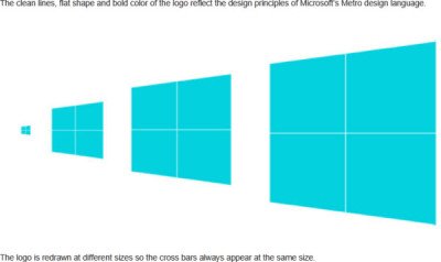
The new identity returns the logo to its roots. The name Windows was originally introduced as a metaphor for seeing into screens and systems and a new view on technology. The new identity re-introduces this idea with the actual visual principles of perspective. It also reflects the Metro design language developed by Microsoft for its products, graphics and user interfaces, says Pentagram.
The original Windows 1.0 logo looked like a window and resembled panes of glass.

The new Windows 8 logo is designed to reflect the sleek, modern “Metro” design language first introduced by Microsoft in its Windows 7 Phones. It is deliberately neutral so that it can function effectively in a myriad of uses, especially motion. The old logo was flat and drawn in motion; the new logo is a neutral container that can convey actual motion, becoming a more active and effective brand.
It is deliberately neutral so that it can function effectively in a myriad of uses, especially motion. The old logo was flat and drawn in motion; the new logo is a neutral container that can convey actual motion, becoming a more active and effective brand.
Well, I hope you find this explaination of the concept convincing enough!

“Well, I hope you find this explaination of the concept convincing enough!”
Well, no not really. Whatever the expalnation may be, it still does not address the fact that the logo is ugly as all get out. It looks like a two year old designed it and probably could have been designed with more taste and fuctionality by one of the tens of thousands that design on the web every single day and Microsoft could have gotten their new logo for a steal. Instead they choose to go with a big time design company, and it looks to my like Microsoft got taken to the cleaners on this one!
and it looks to me like Microsoft got taken to the cleaners on this one!
I like this logo
My Synesthesic sense of it tells me its pure as water, structured for the future and wants me to touch it.