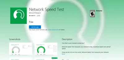
Microsoft has improved the Windows Store on the web with a more touch-friendly design, and one that looks much better than the previous art of mess. We can tell that there’s a new background image for each app, and the texts are much larger than before. This should make it possible for touchscreen users to have a better experience.

Windows Store on the web gains several improvements
There’s also new hardware icons to determine where an app can be used. For example, some apps on the Windows Store can be downloaded and used on Windows 10 PC, mobile device, Xbox One, Microsoft Band, or HoloLens. These apps are usually the UWP variety that are designed to work on several devices. It’s all about write once, run anywhere, something the Java development language had failed to accomplish.
We’re quite impressed with how the store looks now. The whole thing now has similar look to the Windows Store app available on Windows 10. That’s a good thing because it now means that no matter where folks use the Windows Store, they will experience similar design overall. This should increase usability among other things, and we can’t wait for future improvements.
The only problem we have with the current version of the Windows Store when compared to the version of the Windows Phone 8 days, is the fact that one cannot click on an app from the web store to have it automatically download on mobile. That was such a cool feature back then, and we’re quite disappointed the software giant decided to do away with it.
Have a look at the new Windows Store right here.
Leave a Reply