Google’s own product YouTube have been working on many new things in the past few months. They had rolled out dynamic playlist bar & increased the video length time to 15 mins. Now they have redesigned the End screen of the video. Whenever you finish watching a video on YouTube, the end screen would suggest few other related videos and some share buttons as follows:
This image is a old end screen video, as it looks now. The new screen looks much cleaner and provides more option to people and makes them to interact with.
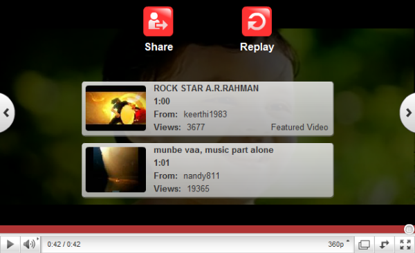
The options such as ‘Like’, Share and Replay has moved to the top and adding to it, it shows some related videos and upcoming videos.

The above picture shows you clearly the new End Screen which YouTube offers to people.
What’s your take on the new redesign ? Like it!?
theres a problem with it. it appears during during the last seconds of the video. does anyone else have the same problem?
I think it’s smart for YouTube to have an end screen that makes it easier to share videos. Also, as a person who frequently changes screen backgrounds, it’s refreshing to see YouTube revamping their screen design. Does this share button connect to Twitter? I just watched a video that is a year old, and when it finished I saw the old end screen. Is the new end screen only going to show up on new videos?
“theres a problem with it. it appears during during the last seconds of the video. does anyone else have the same problem?”
Yep. It sucks. They killed the punch line of a joke in a video I was watching this way. Why the hell would they intentionally do this?