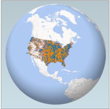
Finally, the most awaited update for Office 365 regarding the Power Map for Excel is out on February 10, 2015. As promised by Microsoft in December 2014, they have shared this ‘big thing’ with the world on the scheduled time, which is February 2015.

Microsoft mentions in the Office Blogs about the revelation of this update,
“In our December update, we promised to have some big things to share about Power Map for Excel in the first quarter of 2015. This month, we are ready to start revealing a few of these great additions. With our brand new feature, data cards, and a few amazing improvements to how you use heat maps, we are looking forward to seeing the new stories you will tell with your data!”
Power Map for Excel is the new add-in created for Excel which can create a 3D visualization of geographical and temporal data. With the help of Power Map for Excel; mapping, exploring, and interacting with such huge data becomes a smooth process and the new representation of the data enables people to discover the data in a new way.
Additions made in Power Map for Excel
- Data Cards – Tooltips: Data Cards now offer the tooltip feature in Power Map for Excel. The tooltip lets you display more relevant information about the data on your map. This feature helps you when you want to quickly find out all the details from the columns and pie chart visualizations. Microsoft mentions an example of how the tooltip becomes useful in drilling down the data. If you want to show a list of Olympic events along with the associated medal count for a particular duration and a specific country, then the tooltip will do it for you in no time. All you have to do is to hover over or click any visualization on the map and a data card is displayed.
- Heat Map Improvements: The heat maps are used in Power Map for Excel to inspect the trends and outliers in your data through a color scale. Now, with the new update in Power Map for Excel, you can see some new and exciting features added to heat maps. The new features are as follows:
- Changing the aggregation type
- Customizing the color scale
The new updates in Power Map for Excel are certainly making the add-in full of features.
You can read more about this update on the Office Blogs.