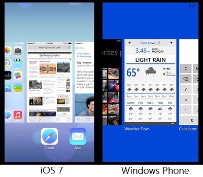
Microsoft named Windows 8’s interface as ‘Modern UI‘ . Until then, it was referred as ‘Metro’ by Microsoft. Whatever, you may name the interface as, the point is the flat and boxy-tiled interface is being liked by many today. So much, that even Apple has decided to adopt this Modern UI design, deviating from its old-fashioned glass-like translucency effects.
Apple’s iOS 7 UI internally referred to as ‘Modern UI’ by its employees
Apple’s latest OS update – iOS 7 too adopts a flat look, similar to that in Windows 8. According to a Wall Street Journal post, Apple has not only copied the interface design but the name of the project too. iOS 7 is also referred as ‘Metro UI’ by its designers, internally.
Internally?? Yeah, that’s the keyword. Apple presenters have been warned from referring iOS redesign as “Modern UI” in public. Why? Just to make sure that their designers work is not mocked by Microsoft and its fans.
Here’s what Apple describes the new design of iOS as
“Nothing we’ve ever created has been designed just to look beautiful. That’s approaching the opportunity from the wrong end. Instead, as we reconsidered iOS, our purpose was to create an experience that was simpler, more useful, and more enjoyable — while building on the things people love about iOS. Ultimately, redesigning the way it works led us to redesign the way it looks. Because good design is design that’s in service of the experience.
What are your thoughts? Let us know them in the comments section below.

IOS 7 is a modern UI but not so modern as windows phone UI