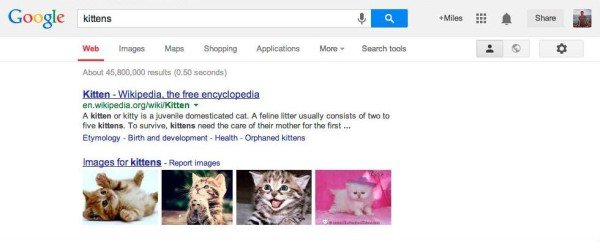
Following in the footsteps of Yahoo and Bing, the Search Engine Giant, Google announced a new logo and navigation bar for all its websites. The new logo is much flatter with enhancement in the color palette and letter shapes.
Current logo
New logo
Although the new logo was spotted on the web some time back, it wasn’t sure if the company would be using the same as its official logo. However, through a blog post, company has confirmed the changes in the logo and the navigation bar. The company stated.
“Regardless of your routine, getting around Google should be seamless, and once you’re inside an app, you don’t want any distractions. So we’re introducing an updated Google bar that streamlines your experience across products and devices. As part of this design, we’ve also refined the color palette and letter shapes of the Google logo”.
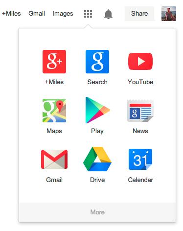
Have a look at the revamped navigation bar below.
The new navigation bar will not have the black bar that currently runs atop of the Google’s properties. Just take a look below of the current black bar that may soon vanish.
Google says that there will be a new menu close to the share and account info where all its products will be accessible under a new application launcher. This launcher looks very similar to the application launcher on Chrome OS and brings up an application grid of different Google services thereby providing easy access to them.
This is not the first time when Google has gone in for a logo revamp. The last time it happened in 2010 when Google brightened the colors and removed the shading partially. This time, even though the updated logo isn’t really a complete change of the former it still looks refreshingly new. Google plan to roll in the updates in the coming few weeks, so watch out and let us know how is the new design treating you.


I wish Google would stop hiding things in drop-down menus. They did this to Gmail a year or two ago, and it has complicated what was meant to be a simple email experience. Life was much simpler when options were immediately visible, rather than hidden!
Hi Vinayak, thank you for your comment. I Personally feel that these changes are good, but only for those who know how to harness them.