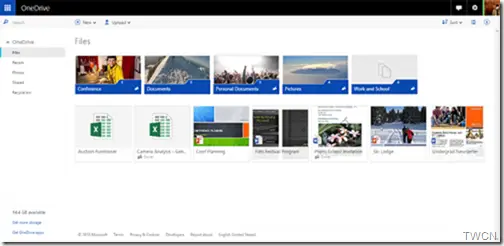
Microsoft is rolling out a completely re-designed responsive OneDrive web experience. OneDrive web UI gets a total redesign. We have been seeing regularly many updates including design updates to OneDrive apps on Android, Windows Phone and iOS. A few months back, the OneDrive Android app got a complete redesign. Recently we also saw OneDrive bringing photos to Android wear. The OneDrive team has been busy releasing major updates to OneDrive apps. Now the team has released a completely redesigned OneDrive web experience.

Visual grid, color palette, and typography:
The OneDrive team describes this design work update, as not just a new coat of paint. They have started from scratch to provide a truly cohesive web experience across the breadth of devices people use to access OneDrive.
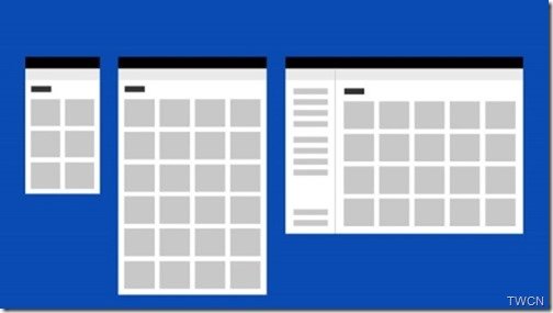
The team decided on 4px grid after several rounds of iteration. This allowed them to make the layout flexible maintaining the visual density and stability. They wanted a single grid that could work across web and native layouts.

“In parallel, we did an extensive audit of the class of device and its relationship to usage. This helped us better target the ideal number of responsive breakpoints for our experience. We landed on six, and from that developed our responsive grid. “

Then the color palette was also looked into.
Our brand color is a well-established #234fa2, so we started there and worked up a full set of complimentary tonal grays with a few accents. We did a deep accessibility pass, made a few adjustments, and arrived at the color palette you see in the product today. It’s a well-balanced set of colors, that brings a refreshing, creative energy to the OneDrive UI.
Next was typography. Clarity and simplicity improves the way a design communicates. The team explains :
“…was to create a more legible, readable, and clear experience that celebrates your content, not our UI…” .
Segoe is the core visual identity element throughout Microsoft’s product ecosystem. Minimising the number of treatments, the team created a type ramp that created a clear hierarchy of size and weight. A balanced feel still providing clarity was provided.
We can thus see that a thorough look into the design has been done. Tyler Rasmussen,Principal Design Manager, OneDrive further said, still the redesign is not yet finished.
It was a lot of work, and we hope you like it. But, the most exciting thing is we aren’t finished yet, so stay tuned for even more improvements to come!
This new experience is still rolling out to all OneDrive users in the next few days, while the business users will get by end of this year.
Love the new design, this product keeps getting better.
Hi Aaron, nice that you already got the redesigned OneDrive…for many of the users its not yet rolled out..
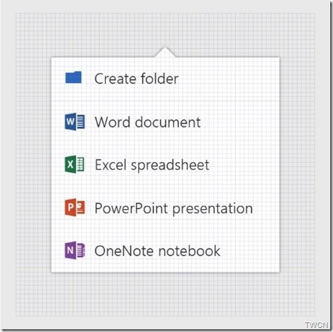
Looks great. I like the new icons for the different file types.
This new UI puts the product 5 years in the past, in my opinion. The old one was much more flat, clean, NORMAL and most importantly – intuitive.
No file extensions just makes this a backward step. I’ve got .pdb and .dll files in the same folder, but both appear as the same file.
Shockingly bad that things like this get overlooked.