Opera Software (changed to Opera now) came with up 2 major announcements on its web browser this week. First, it was the release of Opera 33, the new improved web browser for desktops, second the launch of the re-designed “O”, its new product logo. The browser update is available to users on Windows,OS X or Linux desktops or for those who use Opera Mini on Windows Phone or on iOS.

The pretty looking”new icon” can be found on the button, taskbar, and the desktop screen once you install the new browser.
Opera’s journey to the new “O”
The company says that it had to invest almost 17 months before they could come up with the rebranded Opera logo. Sean D’Arcy, explained what the new logo is meant for the company. Emphasizing on the tagline “DO MORE” he mentioned,
“The 3-dimensional “O” symbolizes a gateway that leads you to more: more content, more discoveries, more answers, more communication, more fun, more data savings, more of life – whatever you seek online, Opera helps you do more!”
The company teamed up with various professionals during the development phase of 17 months. While a London based creative agency called as DixonBaxi helped the company in developing brand strategy, Anti, a Norwegian-based creative agency assisted on the visual side. Opera also worked with Jon Hicks from Iconfactory to work on the design of the logo.
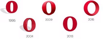
Below is how Opera’s logo has changed over the years,

Having released icons for every stage, ie, development, beta and stable, the company said that the developer icon will have the mesh, representing technology as the building blocks. Beta version will have a touch of red, while the stable version will be a complete red logo.
As a matter of fact, Opera reaches out to over a billion internet users every month, with 350 million people around the world experiencing the internet through Opera apps and services and the 1.1 billion people using Opera Mediaworks.
Leave a Reply