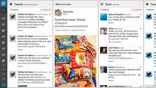
It was request by many TweetDeck users had! They wanted to see an improved TweetDeck in terms of looks and features. And now TweetDeck has introduced a brand new look that will surely please its users. Matching with Twitter’s design aesthetics, this TweetDeck update provides a fresher, cleaner, lighter and simpler design. Not only its looks, but its has also enhanced its usability.

Let us check some of the significant changes –
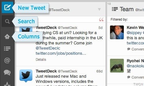
- The top bar has been moved to the side with new tweet button at the top for opening the familiar new tweet window. And just below it, the Search icon which opens the search window.
- Improved column reordering with easier navigation.
- Further icon series represents what column you have in your TweetDeck. Just roll over it to see the title in detail. Clicking on them , moves the display on that particular scrollable column. Will be handy where there are many columns.
- And you can just drag these column icons for quick column reordering

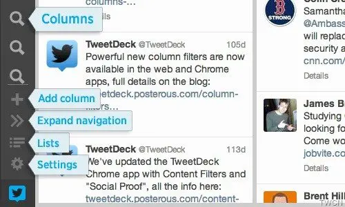
- Next you have the Add Column icon.
- And at bottom of the side bar, these 3 icons will always be there –
- Expand navigation to expand the sidebar to show the titles of each button and the column names.
- Lists icon to open the Lists window
- Settings icon to make changes as per your needs and can also more Twitter accounts

So these are some of the new look and usability enhancements in the TweetDeck.
These were announced on the TweetDeck blog. Give it a try.