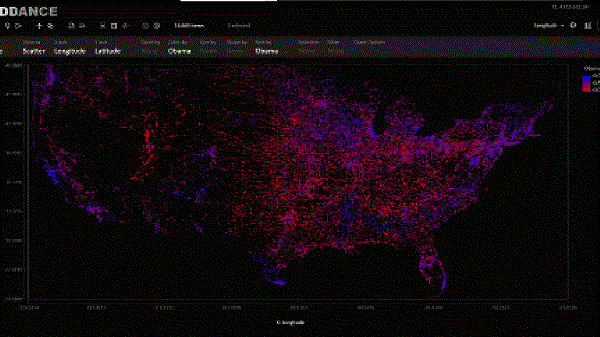
The research division of Microsoft, Microsoft Research has released a new tool – SandDance a free data visualization app that allows users to get insights on their research projects. The application will be currently available as a standalone Web-based tool. However, its support will also be extended to Power BI users as a custom visual that represents all the data in the form of aggregations.

Apart from displaying the individual contents, the experience of the service will offer a way to organize all the important elements on the screen, predict how it looks overall. As the name suggests, the data entered will “dance” from screen to screen i.e., present it in the animated form via 3D scatterplot, maps, charts, histograms and many other options.
SandDance from Microsoft Research Division
One can also find other complete list of features including guided tours, shareable insights, scripts and themes. Depending on the response the tool will generate in the months to come, the research team will be prototyping new ideas and most likely feature them into the PowerBI custom visual.
“We had this notion that a lot of visualization summarized data, and that summary is great, but sometimes you need the individual elements of your data set too,” says Steven Drucker, a principal researcher who’s focused on information visualization and data collections. “We don’t want to lose sight of the trees because of the forest, but we also want to see the forest and the overall shape of the data. With this, you’ll see information about individuals and how they’re relative to each other. Most tools show one thing or the other. With SandDance, you can look at data from many different angles.”
Microsoft claims, SandDance Power BI visual is different from most other visuals that already exist for Power BI in a way that it shows all the data organized into aggregations. it’s true whenever figures are represented as animated graphs that you can navigate as you want, they become a lot easier to understand.
Leave a Reply