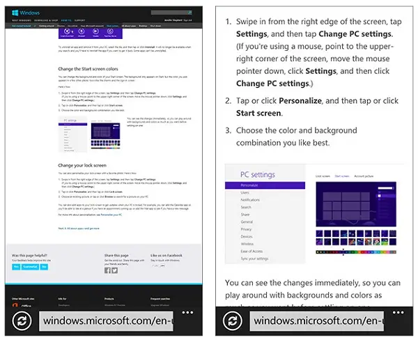
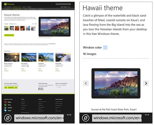
In its latest attempts to get smartphone users to visit Windows related sites using their mobile devices, Microsoft has revamped its Windows.com site and ‘Personalization Gallery’. Earlier, visiting these sites via phone devices was not very convenient as the text appeared small and couldn’t be read without zooming in a portion of the page.
Now, this is all possible, without zooming. Windows.com has been re-designed in such a way that, not only do text and images scale themselves appropriately while viewing but even some content elements close themselves to save space. This makes it convenient for you to read texts and view entire pages at a readable size more easily.
Try it yourself! Go to Windows.com on your phone or tablet, or open it up in Windows 8 Snap view. Notice how all the elements of the site re-flow, so that the text remains at a readable size and images scale and re-position themselves so you can view them easily. No more zooming in and out to alternate between reading and navigating!
The changes made to the Windows.com site are also applicable to ‘Personalization gallery’. Of course, you can’t use themes displayed there on your phone, but what you can certainly do is browse them to find ones that interest you and would like to download later on to your PC or Windows tablet.

You can read the themes information which was earlier not readable due to smaller size and preview the images in a theme, says the Windows Blog. No matter what device you are using, tablet or a smartphone, the picture switcher re-flows to give you the biggest possible preview!
Leave a Reply