Microsoft is undergoing a lot of change both in its approach towards the product design and the products itself. For instance, the sweet success it tasted with the Windows 10 and the Continuum feature is something that helped Microsoft regain the traction. Now it seems to be working real hard in revamping the Bing products.

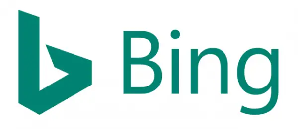
Bing Search gets a new logo
The Bing logo has been replaced by a fresh one, one that seems to fall with Microsoft latest design philosophies. The Logo now has a Capital “B” and the yellow color is replaced by teal blue. Bing had last updated the logo last time on 2013.
Microsoft representative was quoted as saying to Search Engine land,
“Bing is a successful standalone business and also a key component of many experiences inside and outside of Microsoft,” He further added that “We’re changing our look to complement our partners own brands and because teal looks great within experiences like Windows.”
Rik van der Kooi, Microsoft’s corporate VP of Advertisement and Search was optimistic about the Bing growth and said that Microsoft is thrilled with the trajectory. “We are the only search engine that is experiencing steady, consistent growth, and have increased our share for 26 consecutive quarters. And we’re not slowing down,”
If you are thinking that Bing is yet another search engine that failed to make it big think again, as a recent report suggests Bing is eating away the Google Search market share and at the pace it is adding new features it is only a matter of time that it is considered as a worthy competitor for Google.
Leave a Reply